Building Dashboards in R
library(shiny)As is a point of emphasis across all of the posts on this blog, one of the most important skills for any data scientist is the ability to clearly communicate results to a general audience. The people who will be taking further action are interested in the insights rather than the data itself. Unfortunately, too many data scientists bog down in math and computation that’s impenetrable the general reader. This is why tools like Shiny are quickly becoming every data scientist’s best friend.
shiny is a package that can be used to build interactive web pages with R. While that may sound scary because of the words “web pages”, it’s geared to R users who have no experience with web development, and you do not need to know any HTML/CSS/JavaScript.
You can do quite a lot with Shiny: think of it as an easy way to make an interactive web page, and that web page can seamlessly interact with R and display R objects (plots, tables, of anything else you do in R). To get a sense of the wide range of things you can do with Shiny, you can visit the Shiny gallery, which hosts examples of basic (and complex) Shiny apps.
A few of its benefits are:
- Flexibility. You can communicate results via interactive charts, visualizations, text, or tables
- Ease-of-use. If you already know R, you can rapidly develop a cool Shiny app. Check out this excellent tutorial to quickly learn the core concepts
- Share-ability. Built-in capabilities let you share your work easily with colleagues and friends
- Design. Even the default display for Shiny apps is elegant and intuitive
To convince you of its usefullness, let me show you an example.
Shiny App Basics
Before we get started, we have to go over some basics. Every Shiny app is composed of a two parts: a web page that shows the app to the user, and a computer that powers the app. You, as the Shiny app developer, need to write these two parts. In Shiny terminology, they are called UI (user interface) and server.
UI is just a web document that the user gets to see, it’s HTML that you write using Shiny’s functions. The UI is responsible for creating the layout of the app and telling Shiny exactly where things go. The server is responsible for the logic of the app; it’s the set of instructions that tell the web page what to show when the user interacts with the page.
When creating a new shiny app (File > New File > Shiny Web App), you will be asked the Application type: single file (app.R) or multiple file (ui.R/server.R). A single file configuration puts both the server and user interface code into a one app.R file, while a multiple file configuratin separates them. This latter is the preferable way to write Shiny apps when the app is complex and involves more code, but in this tutorial we’ll stick to the simple single file. In practice, the two Application types will produce the same output.
Final Grade Calculator
As a simple example, I created a shiny app that calculates your Final Grade in a class based on the grades and weights of homeworks and the final exam. Here’s a screenshot of the Shiny app:
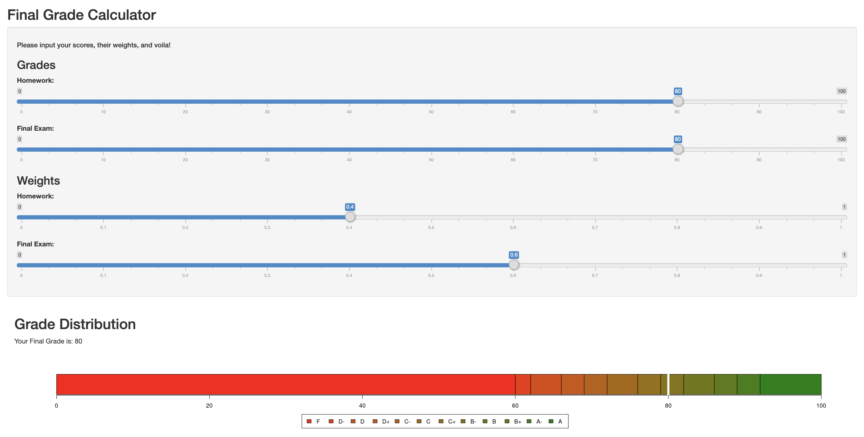
We have a series of 4 sliders where the viewer can input their specific information followed by their final grade and a plot of its associated letter grade.
The code for the app is as follows:
ui <- fluidPage(
    verticalLayout(
    titlePanel("Final Grade Calculator"),
        wellPanel(
            h5("Please input your scores, their weights, and voila!"),
            h3("Grades"),
            sliderInput(inputId = "homework", label = "Homework:",min = 0,max = 100,value = 80),
            sliderInput(inputId = "final.exam", label = "Final Exam:",min = 0,max = 100,value = 80),
            h3("Weights"),
            sliderInput(inputId = "homework.weight", label = "Homework:",min = 0,max = 1,value = 0.5),
            sliderInput(inputId = "final.weight", label = "Final Exam:",min = 0,max = 1,value = 0.2)),
        mainPanel(width = 12,
            h2("Grade Distribution"),
            textOutput("output"),
            plotOutput("plot", height = "175px", width = "100%")
        )
    )
)

dat<-matrix(c(60,2,4,3,3,4,3,3,4,3,3,8), ncol = 1, nrow = 12)
rownames(dat) <- c("F","D-","D","D+","C-","C","C+","B-","B","B+","A-","A")
colors <- c('#ff0000', '#ee3400', '#dd4800', '#cc5600', '#bb6000', '#a96800', '#986f00', '#857400', '#707800', '#597b00', '#3e7e00', '#008000')

server <- function(input, output) {

    output$output <- renderText({
        grade = input$homework*input$homework.weight + input$final.exam*input$final.weight
        paste0("Your Final Grade is: ", grade)
    })

    output$plot <- renderPlot({
        grade = input$homework*input$homework.weight + input$final.exam*input$final.weight
        if (grade>100) {grade=100}
        par(mar = c(5, 5, 4, 4.1))
        barplot(dat, horiz = TRUE, col=colors)
        lines(x=c(grade, grade), y=c(0,1.5), col="white", lwd=6)
        legend("bottom",legend = rownames(dat),fill = colors, ncol = 12, inset = -1.5, xpd = TRUE)
    })
}
As you can see we start by creating the ui. Here we use the titlePanel() function to specify our title. We also use the sliderInput() function four times and specify the inputId (a string that will be used to access the value on the server side), label (the label that will be displayed), min (the minimum value of the slider), max (the maximum value of the slider), and value (the value that will appear automatically when the app is opened) for each. To finish the ui, we tell R what the outputs will be. In this case, we have a textOutput() with the final grade and a plotOutput() with the plot of the letter grade distribution.
We then have a series of lines that are used to create the plot later on. Basically, we create a matrix with the letter grade divisions and assign a name and color to each letter.
Now onto the server. Since we specified two types of outputs in the ui, we have to have tell the computer what to do for each of those. For the text we calculate the grade and paste it with a description of what the number is. On the other hand, the plot output calculates the grade again, but also creates the barplot and its legend.
Note: The shiny app I created is brutally simple and doesnt even integrate data, which is the main purpose of creating a dashboard. Instead, this post is a soft introduction to R Shiny and its syntax. I encourage you to check out other more advanced apps on the Shiny gallery.
Here are a couple of interactive visualizations from it:
Google Chart Demo
Dashboard for Conference Tweets
Birth Locations of all Players in the 2018 FIFA World Cup
As always, if you have a question or a suggestion related to the topic covered in this article, please feel free to contact me!