The Ins and Outs of Exploratory Data Analysis
Today I wanted to talk about and show my process of exploring a dataset. Exploratory Data Analysis (EDA) is a step in the Data Analysis Process, where a number of techniques are used to better understand the dataset being used. ‘Understanding the dataset’ can refer to a number of things including but not limited to:
- Extracting important variables and leaving behind useless variables
- Identifying outliers, missing values, or human error
- Understanding the relationship(s), or lack of, between variables
- Ultimately, maximizing your insights of a dataset and minimizing potential error that may occur later in the process
The main two goals of EDA are cleaning the dataset and giving us a better understanding of the variables and the relationships between them.
Keep in mind that an EDA workflow is by no means a linear process. It involves (in many cases) multiple back and forths between all the different parts of the process.
For today’s example, I will be using data that comes from the Wall Street Journal and describes post-college salaries categorized by numerous variables.
I first start by loading in the packages that I will be using.
library(tidyverse)
library(infer)
library(broom)
library(forcats)
library(RColorBrewer)
library(knitr)
I then proceed to loading in the data itself. In this case, they are a collection of csv files so I use the function read_csv
salaries_by_region <- read_csv("salaries-by-region.csv",
                   col_names = c("school_name", "region", "start_med_slry",
                                 "mid_car_slry", "mid_car_10th", "mid_car_25th",
                                 "mid_car_75th", "mid_car_90th"),
                   col_types = "cfnnnnnn", skip = 1)

salaries_by_college_type <- read_csv("salaries-by-college-type.csv",
                                     col_names = c("school_name", "school_type", "start_med_slry",
                                 "mid_car_slry", "mid_car_10th", "mid_car_25th",
                                 "mid_car_75th", "mid_car_90th"),
                   col_types = "cfnnnnnn", skip = 1)

salaries_by_major <- read_csv("degrees-that-pay-back.csv",
 col_names = c("major", "start_med_slry", "mid_car_slry",
                                 "percent_chng", "mid_car_10th", "mid_car_25th",
                                 "mid_car_75th", "mid_car_90th"),
                   col_types = "cnndnnnn",
                   skip = 1)
Overview of Datasets
You should always read the data’s documentation. Without even looking at it, I know that there are 3 different datasets with information on post-college salaries:
- Salaries by Degree
- Salaries for Colleges by Type
- Salaries for Colleges by Region
Each of the data sets have the following variables:
- Median starting salary
- Mid-career salaries for the 10th, 25th, 50th, 75th, and 90th percentiles
We can now get a glimpse of the salaries by degree dataset:
kable(head(salaries_by_major))| major | start_med_slry | mid_car_slry | percent_chng | mid_car_10th | mid_car_25th | mid_car_75th | mid_car_90th |
|---|---|---|---|---|---|---|---|
| Accounting | 46000 | 77100 | 67.6 | 42200 | 56100 | 108000 | 152000 |
| Aerospace Engineering | 57700 | 101000 | 75.0 | 64300 | 82100 | 127000 | 161000 |
| Agriculture | 42600 | 71900 | 68.8 | 36300 | 52100 | 96300 | 150000 |
| Anthropology | 36800 | 61500 | 67.1 | 33800 | 45500 | 89300 | 138000 |
| Architecture | 41600 | 76800 | 84.6 | 50600 | 62200 | 97000 | 136000 |
| Art History | 35800 | 64900 | 81.3 | 28800 | 42200 | 87400 | 125000 |
There are a total of 50 observations, where each observation corresponds to a college major. Therefore, the salary information is across various colleges.
On the other hand, the salaries for colleges by type dataset looks like this:
kable(head(salaries_by_college_type))| school_name | school_type | start_med_slry | mid_car_slry | mid_car_10th | mid_car_25th | mid_car_75th | mid_car_90th |
|---|---|---|---|---|---|---|---|
| Massachusetts Institute of Technology (MIT) | Engineering | 72200 | 126000 | 76800 | 99200 | 168000 | 220000 |
| California Institute of Technology (CIT) | Engineering | 75500 | 123000 | NA | 104000 | 161000 | NA |
| Harvey Mudd College | Engineering | 71800 | 122000 | NA | 96000 | 180000 | NA |
| Polytechnic University of New York, Brooklyn | Engineering | 62400 | 114000 | 66800 | 94300 | 143000 | 190000 |
| Cooper Union | Engineering | 62200 | 114000 | NA | 80200 | 142000 | NA |
| Worcester Polytechnic Institute (WPI) | Engineering | 61000 | 114000 | 80000 | 91200 | 137000 | 180000 |
In this case, there are 269 observations, where each is an individual college. They are also differentiated by college type (i.e. Engineering, Liberal Arts, State School, Ivy League, and Party). The only concern is that there seem to be missing values (one of the things we will have to correct when doing EDA).
Lastly, the salaries for colleges by region dataset looks like this:
kable(head(salaries_by_region))| school_name | region | start_med_slry | mid_car_slry | mid_car_10th | mid_car_25th | mid_car_75th | mid_car_90th |
|---|---|---|---|---|---|---|---|
| Stanford University | California | 70400 | 129000 | 68400 | 93100 | 184000 | 257000 |
| California Institute of Technology (CIT) | California | 75500 | 123000 | NA | 104000 | 161000 | NA |
| Harvey Mudd College | California | 71800 | 122000 | NA | 96000 | 180000 | NA |
| University of California, Berkeley | California | 59900 | 112000 | 59500 | 81000 | 149000 | 201000 |
| Occidental College | California | 51900 | 105000 | NA | 54800 | 157000 | NA |
| Cal Poly San Luis Obispo | California | 57200 | 101000 | 55000 | 74700 | 133000 | 178000 |
Here, again each observation is an individual college. However, unlike the previous dataset, this one has the observations separated by region. This dataset also has more observations with \(n=320\). The regions are California, West, Midwest, Northeast, and South. It is interesting that California has been set apart from the West (always be on the lookout for these differences when you are seeing the data, since it can be an area to explore further). There are also some missing values as in the previous data set.
Preliminary Analysis of Datasets
Multiple Category Colleges
Since, both the salaries for colleges by type and region datasets do not have mutually exclusive groupings, we should check if there is any overlap. For example, a Party school can also be a State school or a college can be classified as both in California and the West. We should check how many there are.
salaries_by_college_type %>%
  group_by(school_name) %>%
  mutate(count=n()) %>%
  filter(count>1) %>%
  summarise(types=str_c(school_type,collapse = '-')) %>%
kable()| school_name | types |
|---|---|
| Arizona State University (ASU) | Party-State |
| Florida State University (FSU) | Party-State |
| Indiana University (IU), Bloomington | Party-State |
| Louisiana State University (LSU) | Party-State |
| Ohio University | Party-State |
| Pennsylvania State University (PSU) | Party-State |
| Randolph-Macon College | Party-Liberal Arts |
| State University of New York (SUNY) at Albany | Party-State |
| University of Alabama, Tuscaloosa | Party-State |
| University of California, Santa Barbara (UCSB) | Party-State |
| University of Florida (UF) | Party-State |
| University of Georgia (UGA) | Party-State |
| University of Illinois at Urbana-Champaign (UIUC) | Party-State |
| University of Iowa (UI) | Party-State |
| University of Maryland, College Park | Party-State |
| University of Mississippi | Party-State |
| University of New Hampshire (UNH) | Party-State |
| University of Tennessee | Party-State |
| University of Texas (UT) - Austin | Party-State |
| West Virginia University (WVU) | Party-State |
As hinted at above, there are 20 colleges in the salaries by college type dataset with more than one college type. The majority are both Party and State schools excpet for Randolph-Macon College which is a Party and Liberal Arts school.
Let’s check the same thing but for the salaries by college region dataset.
salaries_by_region %>%
  group_by(school_name) %>%
  mutate(count = n()) %>%
  filter(count > 1) %>%
kable()| school_name | region | start_med_slry | mid_car_slry | mid_car_10th | mid_car_25th | mid_car_75th | mid_car_90th | count |
|---|
Luckily, there are no colleges that are listed under multiple regions. Because this dataset has the most observations, and is the most complete in terms of unique colleges, we will use it to explore any relationships between the salary-related variables.
Missing Data
Another possible problem that we noticed earlier was that two of the datasets have missing values. We should inspect further in which datasets there are most and for which variables.
Here is the missing data by variable for all of the datasets:
nmd_vec_to_df <- function(x, start_col) {
  nms <- names(x)
  dta <- unname(x)
  df <- data.frame()
  df <- rbind(df, dta)
  names(df) <- nms
  return(df[, start_col:length(colnames(df))])
}

colSums(is.na(salaries_by_major)) %>% nmd_vec_to_df(2) %>% kable()| start_med_slry | mid_car_slry | percent_chng | mid_car_10th | mid_car_25th | mid_car_75th | mid_car_90th |
|---|---|---|---|---|---|---|
| 0 | 0 | 0 | 0 | 0 | 0 | 0 |
colSums(is.na(salaries_by_college_type)) %>% nmd_vec_to_df(3) %>% kable()| start_med_slry | mid_car_slry | mid_car_10th | mid_car_25th | mid_car_75th | mid_car_90th |
|---|---|---|---|---|---|
| 0 | 0 | 38 | 0 | 0 | 38 |
colSums(is.na(salaries_by_region)) %>% nmd_vec_to_df(3) %>% kable()| start_med_slry | mid_car_slry | mid_car_10th | mid_car_25th | mid_car_75th | mid_car_90th |
|---|---|---|---|---|---|
| 0 | 0 | 47 | 0 | 0 | 47 |
We see that there is missing data for the 10th and 90th percentiles of the mid-career salaries in both the salaries by college type and region datasets. Fortunately, we have data on the 25th and 75th percentiles across all the datasets and can thus give us perspective on variability although will lack accuracy in the extreme salaries.
Analysis of Salaries
Distribution of Starting and Mid-Career Salaries
Now that we have had an initial look at the data and dealth with missing values, we can start digging into variables of interest. We can first look at the distributions of starting median salaries and mid-career salaries. This will show how much they vary and by how much they differ.
salaries_start_vs_med <- salaries_by_region %>%
  select(start_med_slry, mid_car_slry) %>%
  gather(timeline, salary) %>%
  mutate(timeline = as_factor(timeline))

ggplot(salaries_start_vs_med, aes(salary, fill = timeline)) +
  geom_density(alpha = 0.2, color = NA) +
  geom_histogram(aes(y = ..density..), alpha = 0.5, position = 'dodge') +
  scale_fill_manual(values = c('darkgreen', 'purple4'), labels = c('Starting Median Salary', 'Mid-Career Median Salary')) +
  scale_x_continuous(labels = scales::dollar) +
  theme(legend.position = "top",
        axis.text.y = element_blank(), axis.ticks.y = element_blank()) +
  xlab('Salary') +
  ylab('Density') +
  theme(legend.title=element_blank())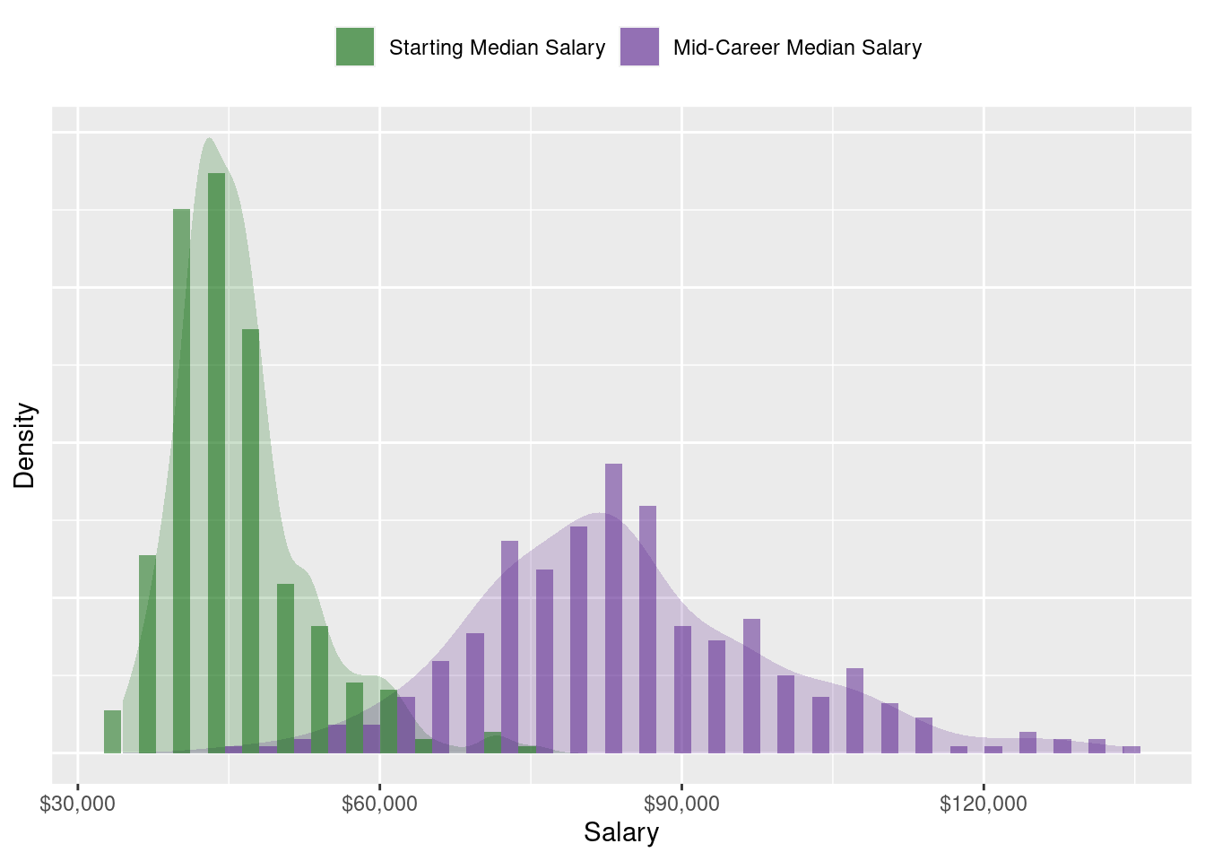
The distribution of starting median salaries can be seen to be more concentrated at lower ranges and is slightly right-skewed. Graduates start out with a median of $45,100, albeit there is a maximum median starting salary of $75,500. As alumnus gain more work experience and they progress to mid-career, the distribution of salaries becomes more spread out and the median increases to $82,700. These are some basic insights that we are looking for with EDA.
Correlation between Starting and Mid-Career Salaries
An interesting, yet self-explanatory, query is the relationship between starting and mid-career salaries. Is there a correlation? Let’s calculate the correlation but also make a plot to answer this question.
ggplot(salaries_by_region, aes(x=start_med_slry,y=mid_car_slry)) +
  geom_point(alpha=0.6, color = 'darkgreen') +
  geom_smooth(se=FALSE, color = 'black') +
  scale_x_continuous(labels = scales::dollar) +
  scale_y_continuous(labels = scales::dollar) +
  xlab('Starting Median Salary') +
  ylab('Mid-Career Median Salary')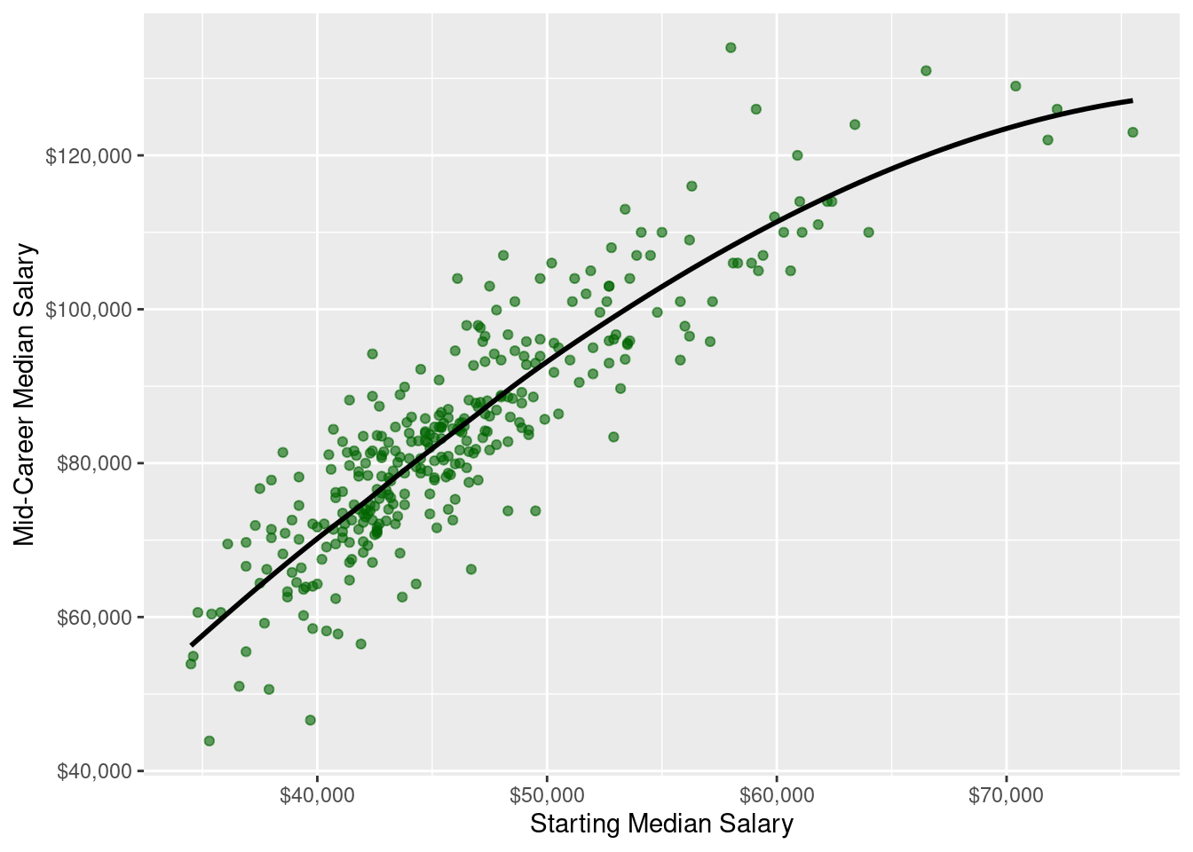
paste('The correlation coefficient is',
      round(with(salaries_by_region, cor(start_med_slry, mid_car_slry)), 4))
## [1] "The correlation coefficient is 0.8816"There seems to be a fairly strong relationship, with a correlation coefficient of 0.8816, but not simply linear. As starting median salaries increase, so do mid-career salaries, but the slope becomes flatter indicating that there is a cap. There isnt enough information to make a conclusive argument about the asymptote, though. This is something that we can explore further in our analysis after EDA.
Salaries by Major
Have you ever been told that the arts are not profitable or that you will never make money with a language degree? How true is that? Let’s investigate which majors have the highest starting and mid-career salaries.
p1<-ggplot(salaries_by_major,aes(x=reorder(major,start_med_slry),y=start_med_slry)) +
  geom_col(fill="darkgreen",alpha=0.5) +
  geom_col(aes(x=reorder(major,mid_car_slry),y=mid_car_slry),alpha=0.3) +
  geom_text(aes(label=scales::dollar(start_med_slry)),size=3,hjust=1.1) +
  scale_y_continuous(labels = scales::dollar) +
  xlab(NULL) +
  ylab('Starting Median Salary') +
  coord_flip() +
  ggtitle("Highest Starting Salaries") +
  theme(plot.title = element_text(hjust = 0.5))
p2 <- ggplot(salaries_by_major, aes(x = reorder(major, mid_car_slry), mid_car_slry)) +
  geom_col(alpha = 0.5, fill = 'purple4') +
  geom_col(aes(x = reorder(major, mid_car_slry), start_med_slry), alpha = 0.4) +
  geom_text(aes(label = scales::dollar(mid_car_slry)), size = 3, hjust = -0.1) +
  scale_fill_manual(values = c('darkgreen', 'purple4')) +
  scale_y_reverse(labels = scales::dollar) +
  scale_x_discrete(position = 'top') +
  xlab(NULL) +
  ylab('Mid-Career Median Salary') +
  coord_flip() +
  ggtitle("Highest Mid-Career Salaries (50th Percentile)") +
  theme(plot.title = element_text(hjust = 0.5))

gridExtra::grid.arrange(p1,p2,ncol=2)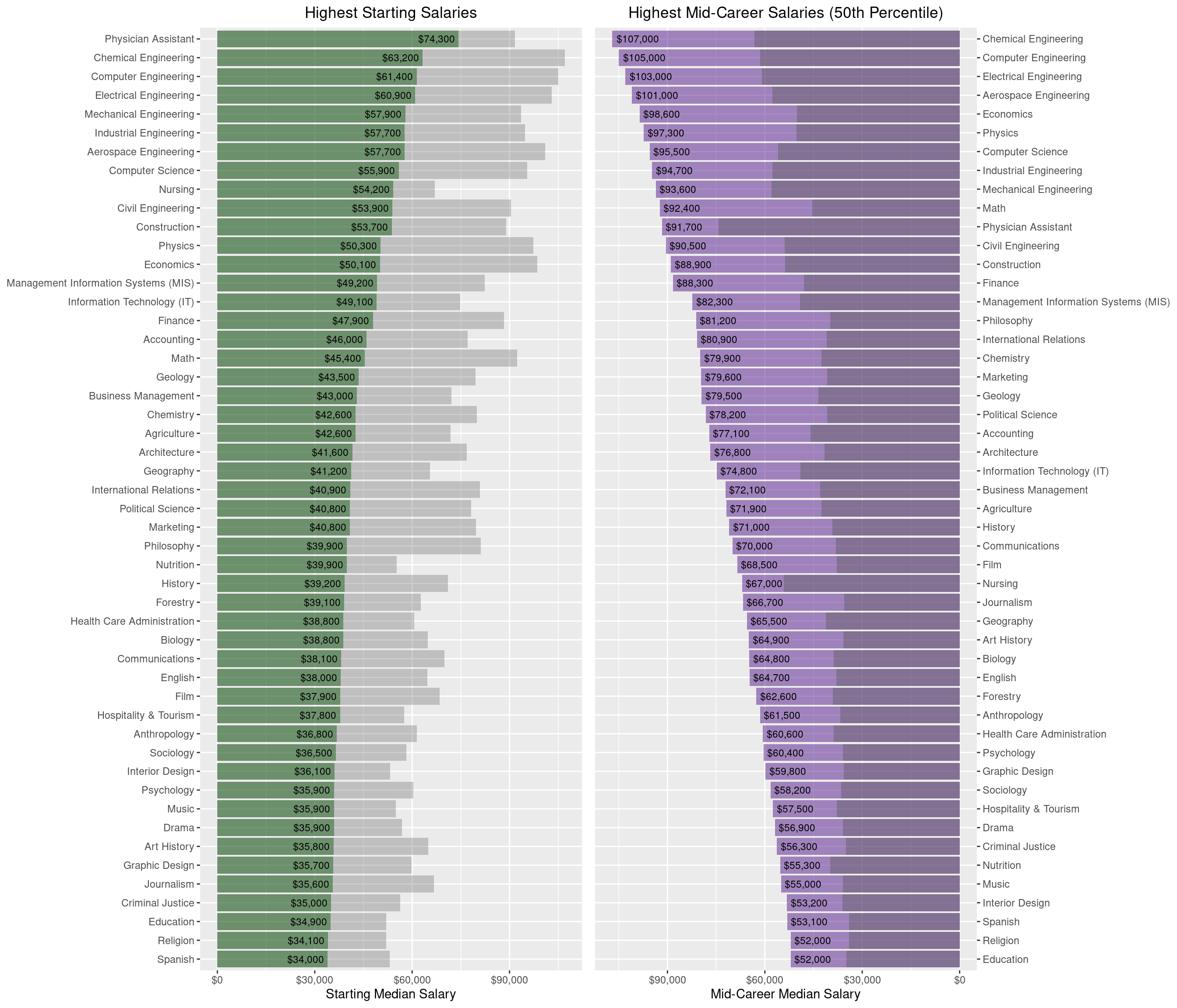
In the left plot, the gray bars show mid-career salaries for reference. Similarly, the right plot shows starting salaries in the darker shade.
Engineering, Computer Science, and two health-related degrees seem to have the highest median starting salaries. What about long-term salary potential? Unsuprisingly, Engineering is at the top again followed by a couple of STEM majors and Economics. We see that a Philosophy degree results in an average starting salary yet leads to a lucrative mid-career salary. What other degrees have large salary growth from starting to mid-career?
ggplot(salaries_by_major, aes(x=reorder(major,percent_chng),y=mid_car_slry)) +
  geom_col(alpha=0.5, fill = '#33B5FF') +
  geom_col(aes(x=reorder(major,percent_chng),y=start_med_slry),alpha=0.4) +
  geom_text(aes(label=scales::percent(percent_chng/100)),size=3,hjust=1.1) +
  scale_y_continuous(labels = scales::dollar) +
  xlab(NULL) +
  ylab('Salary') +
  coord_flip() +
  ggtitle("Percent Changes in Salaries by Major") +
  theme(plot.title = element_text(hjust = 0.5))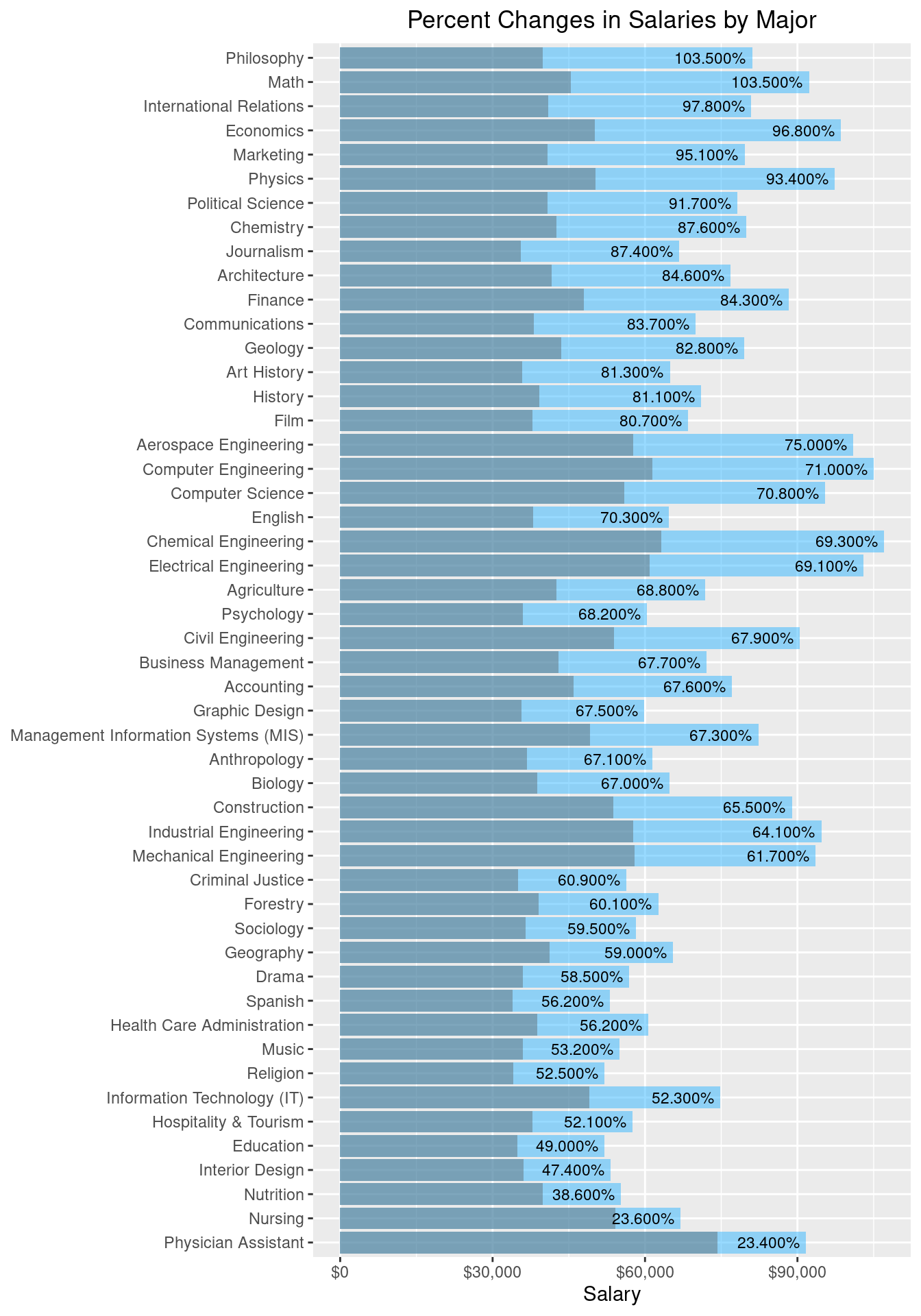
In this plot, the blue bars reflect mid-career salaries and the gray are for starting salaries. Even though Physician Assistant has the highest starting salary, it does not grow much over time. Other majors, such as Philosophy and Math have faster increasing salaries. The common trend still persists here, where many of the Engineering degrees, although not having the most change, start and remain as the highest salaries both in the start and mid-career.
To get an idea for the variability of mid-career salaries, below is a plot of mid-career salaries by their percentiles, ordered by the top 90th percentile of earners.
salaries_by_major_mid_career <- salaries_by_major %>%
  select(-start_med_slry,-percent_chng) %>%
  mutate(mid90th=mid_car_90th) %>%
  gather(percentile,salary,mid_car_10th:mid_car_90th)

ggplot(salaries_by_major_mid_career,aes(x=reorder(major,mid90th),
                                        y=salary,
                                        color=percentile),color="gray") +
  geom_point() +
  scale_color_brewer(type = "div") +
  scale_y_continuous(labels=scales::dollar,sec.axis = dup_axis()) +
  labs(x=NULL,y=NULL) +
  coord_flip() +
  labs(title = "Mid-Career Salaries by Percentiles", color = 'Percentile') +
  theme(legend.position = "top") +
  scale_color_hue(labels = c("10th", "25th", "75th", "90th")) +
  theme(plot.title = element_text(hjust = 0.5))
The top four degrees (Economics, Finance, Chemical Engineering, and Math) have a lot of salary potential. Meaning that they can vary and can possibly be very high. Others such as Nutrition and Nursing have a tight range of mid-career salaries and do not exceed $100k. This is something to keep in mind if you are looking for high mid-career salary potential.
Salaries by College Type
salaries_by_college_type_multiple <- salaries_by_college_type %>%
  group_by(school_name) %>%
  mutate(num_types = n()) %>%
  filter(num_types > 1) %>%
  summarise(cross_listed = str_c(school_type, collapse = '-')) %>%
  arrange(desc(school_name))

logical_party_state <- salaries_by_college_type_multiple$cross_listed == 'Party-State'
names_party_state <- salaries_by_college_type_multiple$school_name[logical_party_state]
The second dataset has salaries by college and college type. Which type of school has the highest salaries? Let’s start by looking at the top twenty schools by mid-career median salary.
accent_colors_edit <- brewer.pal(n = 5, "Pastel1")[c(1:3, 5)]

salaries_by_college_type_top20 <- salaries_by_college_type %>%
  select(school_name, school_type, mid_car_slry) %>%
  arrange(desc(mid_car_slry)) %>%
  top_n(20)

ggplot(salaries_by_college_type_top20, aes(reorder(school_name, mid_car_slry), mid_car_slry, fill = school_type)) +
  geom_col(alpha = 0.8) +
  geom_text(aes(label = scales::dollar(mid_car_slry)), hjust = 1.1, color = 'gray30') +
  scale_fill_manual(values = accent_colors_edit) +
  guides(fill=guide_legend(title="School Type")) +
  ggtitle('Top 20 Schools by Type') +
  theme(plot.title = element_text(hjust = 0.5)) +
  scale_y_continuous(labels = scales::dollar) +
  ylab('Mid-Career Median Salary') +
  xlab(NULL) +
  coord_flip()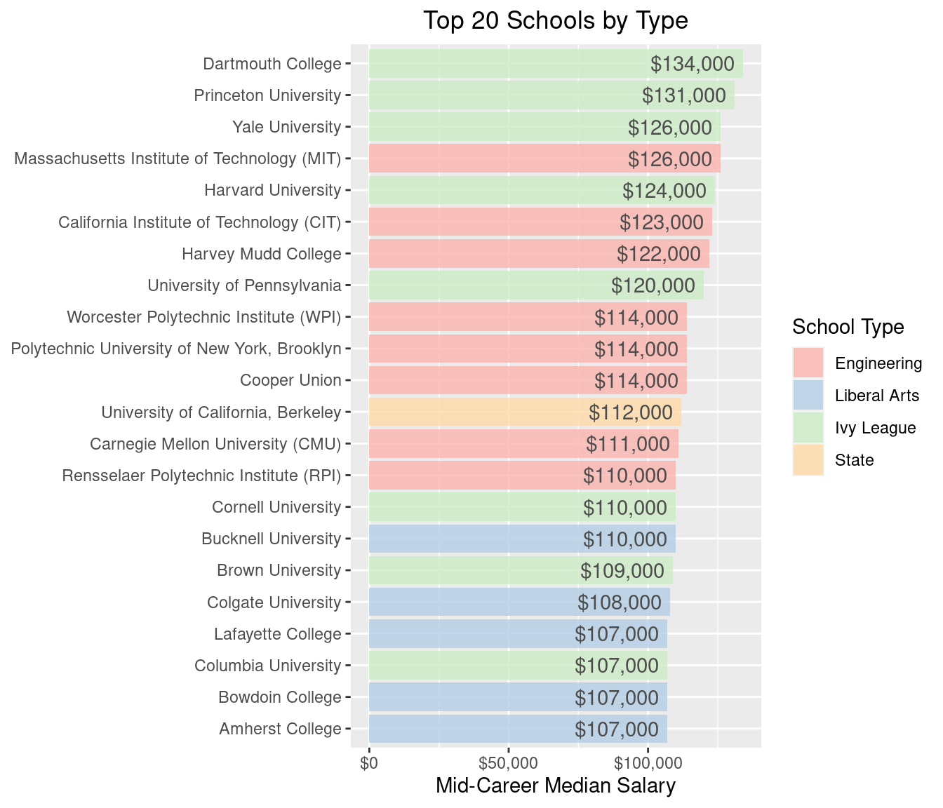
Ivy Leagues dominate the top spots, followed by Engineering and Liberal Arts colleges. Interestingly, the University of California, Berkley is the only State school that is among the top 20. Where are the rest of the State schools and Party schools? How far down are they?
salaries_by_college_type2 <- salaries_by_college_type %>%
  select(school_type, start_med_slry, mid_car_slry) %>%
  gather(timeline, salary, start_med_slry:mid_car_slry) %>%
  mutate(timeline = as_factor(timeline))

ggplot(salaries_by_college_type2, aes(reorder(school_type, salary), salary, fill=timeline)) +
  geom_jitter(aes(color = timeline), alpha = 0.2, show.legend = FALSE) +
  scale_color_manual(values = c('darkgreen', 'purple4')) +
  geom_boxplot(alpha = 0.5, outlier.color = NA) +
  scale_fill_manual(values = c('darkgreen', 'purple4'), labels = c('Starting Median Salary', 'Mid-Career Median Salary')) +
  scale_y_continuous(labels = scales::dollar) +
  ylab('Salary') +
  theme(legend.position = "top") +
  theme(legend.title=element_blank()) +
  ggtitle('Salaries by School Type') +
  theme(plot.title = element_text(hjust = 0.5)) +
  xlab("School Type")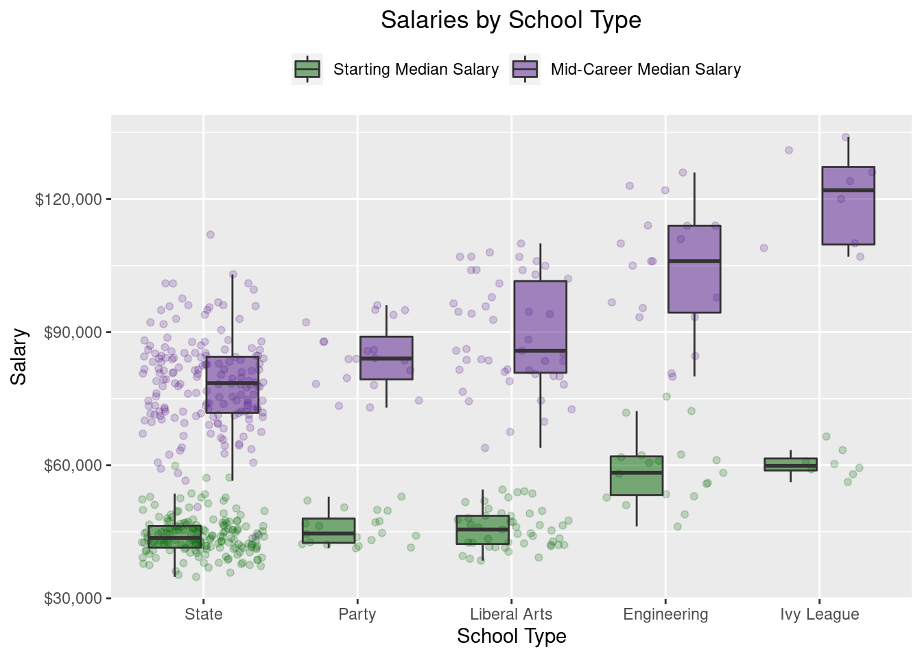
As we saw above, both Engineering and Ivy League schools have higher starting and mid-career median salaries. The most interesting insight, though, is the difference between State schools and Party schools. In the plot above, starting salaries for these two appear to be similar, even if Party school graduates seem to have a higher mid-career salary than State schools. We mentioned earlier that there are schools in the dataset that fall into both categories, but which have better salary outcomes, State schools that are Party schools or State schools that are not Party schools? I wonder how large the difference is if we focus solely on these two mutually exclusive categories (party and not party).
To do this, we will look compare the salaries of State schools that are Party schools with non-Party State schools. The following diagram shows these two groups side by side.
logical_state_not_party <- salaries_by_college_type$school_type == 'State' &
  !(salaries_by_college_type$school_name %in% names_party_state)
names_state_no_party <- salaries_by_college_type$school_name[logical_state_not_party]

stopifnot(sum(salaries_by_college_type$school_type == 'State') ==
            length(names_party_state) + length(names_state_no_party))

logical_state_and_party <-salaries_by_college_type$school_type == 'State' &
  !logical_state_not_party

salaries_of_state_vs_party <- salaries_by_college_type %>%
  select(school_name, start_med_slry, mid_car_slry) %>%
  filter(logical_state_not_party | logical_state_and_party) %>%
  mutate(party_school = school_name %in% names_party_state)

salaries_of_state_vs_party_long <- salaries_of_state_vs_party %>%
  gather(timeline, salary, start_med_slry, mid_car_slry) %>%
  mutate(timeline = as_factor(timeline))

ggplot(salaries_of_state_vs_party_long, aes(party_school, salary, fill = timeline)) +
  geom_jitter(aes(color = timeline), alpha = 0.2, show.legend = FALSE) +
  scale_color_manual(values = c('darkgreen', 'purple4')) +
  geom_boxplot(alpha = 0.5, outlier.color = NA) +
  scale_fill_manual(values = c('darkgreen', 'purple4'), labels = c('Starting Median Salary', 'Mid-Career Median Salary')) +
  scale_y_continuous(labels = scales::dollar) +
  xlab('Party School?') +
  ylab('Salary') +
  theme(legend.position = "top") +
  theme(legend.title=element_blank())
It seems that mid-career salaries for State schools that are Party schools are higher than non-Party State schools. This conjecture needs to be taken with caution, though, since there is much less data for State schools that are also Party schools. To elucidate this point, we ran a t-test to see if there is any statistical basis for this observation. (Sometimes you want to run quick analyses like a t-test when doing EDA to see if you should pursue that line of thinking further)
salaries_of_state_vs_party_startcar_long <-
  salaries_of_state_vs_party_long[salaries_of_state_vs_party_long$timeline == 'start_med_slry', ]

salaries_of_state_vs_party_midcar_long <-
  salaries_of_state_vs_party_long[salaries_of_state_vs_party_long$timeline == 'mid_car_slry', ]

t.test(salary ~ party_school, salaries_of_state_vs_party_startcar_long)
##
## Welch Two Sample t-test
##
## data: salary by party_school
## t = -2.1414, df = 24.274, p-value = 0.04248
## alternative hypothesis: true difference in means is not equal to 0
## 95 percent confidence interval:
## -3859.98495 -72.26876
## sample estimates:
## mean in group FALSE mean in group TRUE
## 43912.82 45878.95t.test(salary ~ party_school, salaries_of_state_vs_party_midcar_long)##
## Welch Two Sample t-test
##
## data: salary by party_school
## t = -3.6534, df = 27.354, p-value = 0.001083
## alternative hypothesis: true difference in means is not equal to 0
## 95 percent confidence interval:
## -10814.540 -3038.901
## sample estimates:
## mean in group FALSE mean in group TRUE
## 77815.38 84742.11Both starting and mid-career salaries showed a significant difference, which implies that if you have a chance to attend a State school, all other factors being equal, it would be more beneficial to attend a State school that is also a Party school. According to the confidence intervals, the difference in starting salaries range from $72.27 to $3,859.98, while mid-career salaries can range from $3,038.90 to $10,814.54. Surprisingly, the starting and mid-career median salaries are substantially higher for State-Party schools compared to State non-Party schools.
Salaries by Region
The third and final dataset is the salaries of colleges by region. As we did before, we will first analyze the top twenty schools by mid-career median salary to see which region seems to be most lucrative.
salaries_by_region_top20 <- salaries_by_region %>%
  select(school_name, region, mid_car_slry) %>%
  arrange(desc(mid_car_slry)) %>%
  top_n(20)

ggplot(salaries_by_region_top20, aes(reorder(school_name, mid_car_slry), mid_car_slry, fill = region)) +
  geom_col(alpha=0.8) +
  geom_text(aes(label=scales::dollar(mid_car_slry)), hjust=1.1, color='gray30') +
  scale_fill_brewer(palette = 'Pastel1') +
  scale_y_continuous(labels = scales::dollar) +
  guides(fill=guide_legend(title="Location of School")) +
  ylab('Mid-Career Median Salary') +
  xlab(NULL) +
  ggtitle('Top 20 Schools by Location of School') +
  theme(plot.title = element_text(hjust = 0.5)) +
  coord_flip()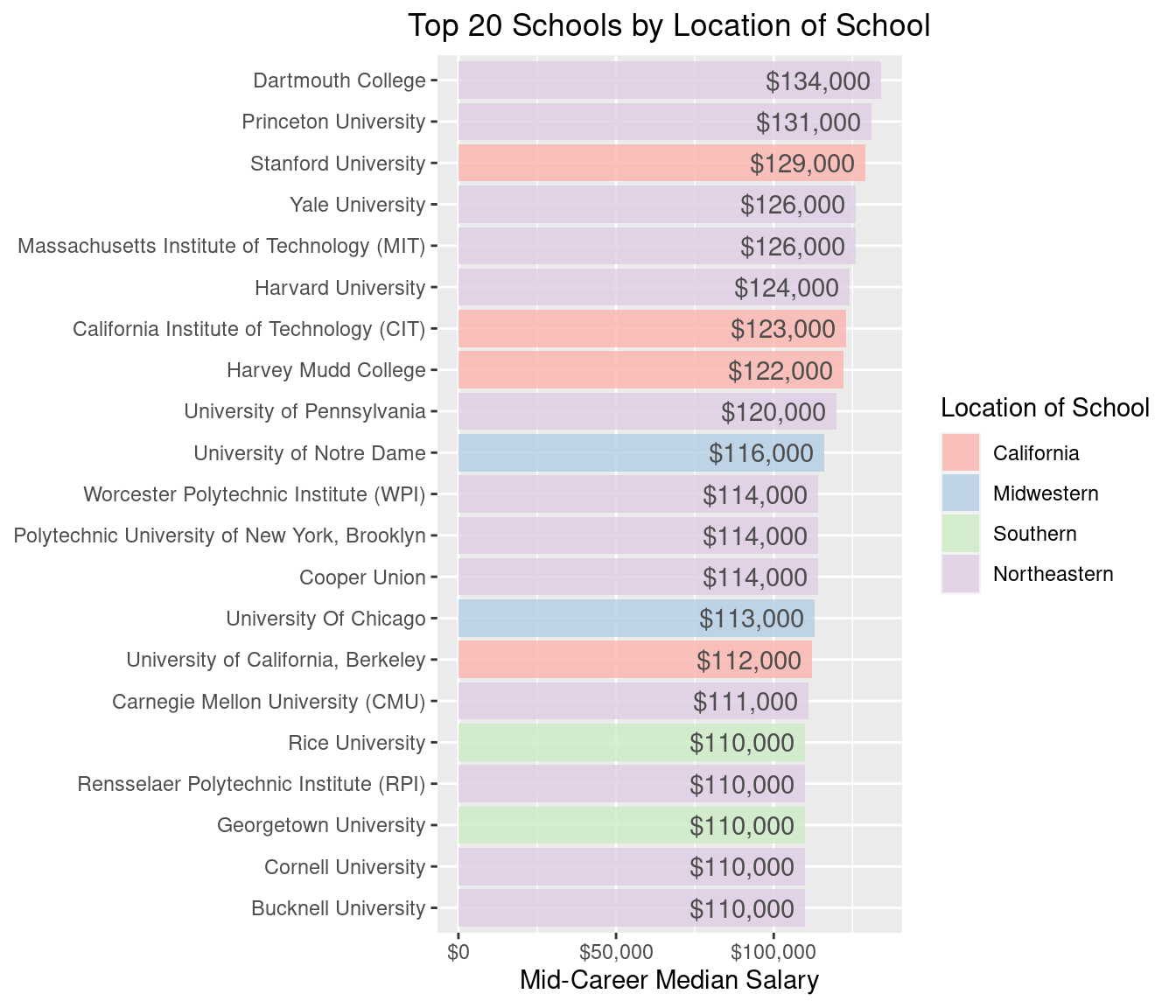
A few important colleges pop-up here like Stanford. I can see why this didn’t have a ‘type’ as it’s more like a ‘West Coast Ivy’. Rice University is also a little difficult to pin down as it’s often referred to as the ‘Harvard of the South’. Here’s a full list of new appearances in the top 20 mid-career salary by region.
salaries_by_region_top20$school_name[!salaries_by_region_top20$school_name %in% salaries_by_college_type_top20$school_name]## [1] "Stanford University" "University of Notre Dame"
## [3] "University Of Chicago" "Rice University"
## [5] "Georgetown University"Like we did above, we should check if there is any difference in starting or mid-career salary by region.
salaries_by_region_slry <- salaries_by_region %>%
  select(region, start_med_slry, mid_car_slry) %>%
  gather(timeline, salary, start_med_slry:mid_car_slry) %>%
  mutate(timeline = as_factor(timeline))

ggplot(salaries_by_region_slry, aes(reorder(region, salary), salary, fill = timeline)) +
  geom_jitter(aes(color = timeline), alpha = 0.2, show.legend = FALSE) +
  scale_color_manual(values = c('darkgreen', 'purple4')) +
  geom_boxplot(alpha = 0.5, outlier.color = NA) +
  scale_fill_manual(values = c('darkgreen', 'purple4'), labels = c('Starting Median Salary', 'Mid-Career Median Salary')) +
  scale_y_continuous(labels = scales::dollar) +
  ylab('Salary') +
  theme(legend.position = "top") +
  theme(legend.title=element_blank()) +
  ggtitle('Salaries by Location of School') +
  theme(plot.title = element_text(hjust = 0.5)) +
  xlab('Region')
This is interesting, both California and the Northeastern region appear to have higher starting and mid-career salaries. Most Ivy League schools are in the Northeastern region, so this could be in part due to that and possibly California’s higher cost of living is the driving force for this region, but that is only a conjecture (Again, making these types of hypotheses can be useful for future investigation).
Region and Type
Another thing I like to try, when we have multiple datasets, is to pull together their information and see if there is anything new. There are a few colleges for which there are both type and region data in their respective data sets. We can combine these to see if we can come up with any finer insights about salary across these 2 categories.
First, what does the distribution look like across college type and region?
logical_keep_type_cols <- colnames(salaries_by_college_type) %in% c('school_name', 'school_type')
salaries_by_college_type_and_region <- merge(x=salaries_by_region, y= salaries_by_college_type[, logical_keep_type_cols], by = 'school_name')

ggplot(salaries_by_college_type_and_region, aes(region, fill = school_type)) +
  geom_bar(position = 'dodge', alpha = 0.8, color = 'gray20') +
  scale_fill_brewer(palette = 'Pastel1') +
  guides(fill=guide_legend(title="School Type")) +
  xlab('Region') +
  ylab(NULL) +
  ggtitle('Number of Schools in Each Region by Type') +
  theme(plot.title = element_text(hjust = 0.5)) +
  theme(legend.position = 'top')
The Northeastern region accounts for all Ivy League schools. It also has the highest number of Liberal Arts and Engineering schools. Also, the most Party schools seem to be in the South.
How do starting salary and mid-career median salary differ over region and type? Below is a look at the mean starting and mid-career salaries over these two categories.
ggplot(salaries_by_college_type_and_region, aes(reorder(region, start_med_slry), mid_car_slry, fill=school_type)) +
  stat_summary(geom = 'col', position = 'dodge', alpha = 0.6) +
  stat_summary(aes(region, start_med_slry, fill=school_type), geom = 'col', position = 'dodge') +
  scale_fill_brewer(palette = 'Pastel1') +
  scale_y_continuous(labels = scales::dollar) +
  xlab('Region') +
  ylab('Salary') +
  ggtitle('Mean Starting and Mid-Career Median Salaries') +
  theme(plot.title = element_text(hjust = 0.5)) +
  guides(fill=guide_legend(title="School Type"))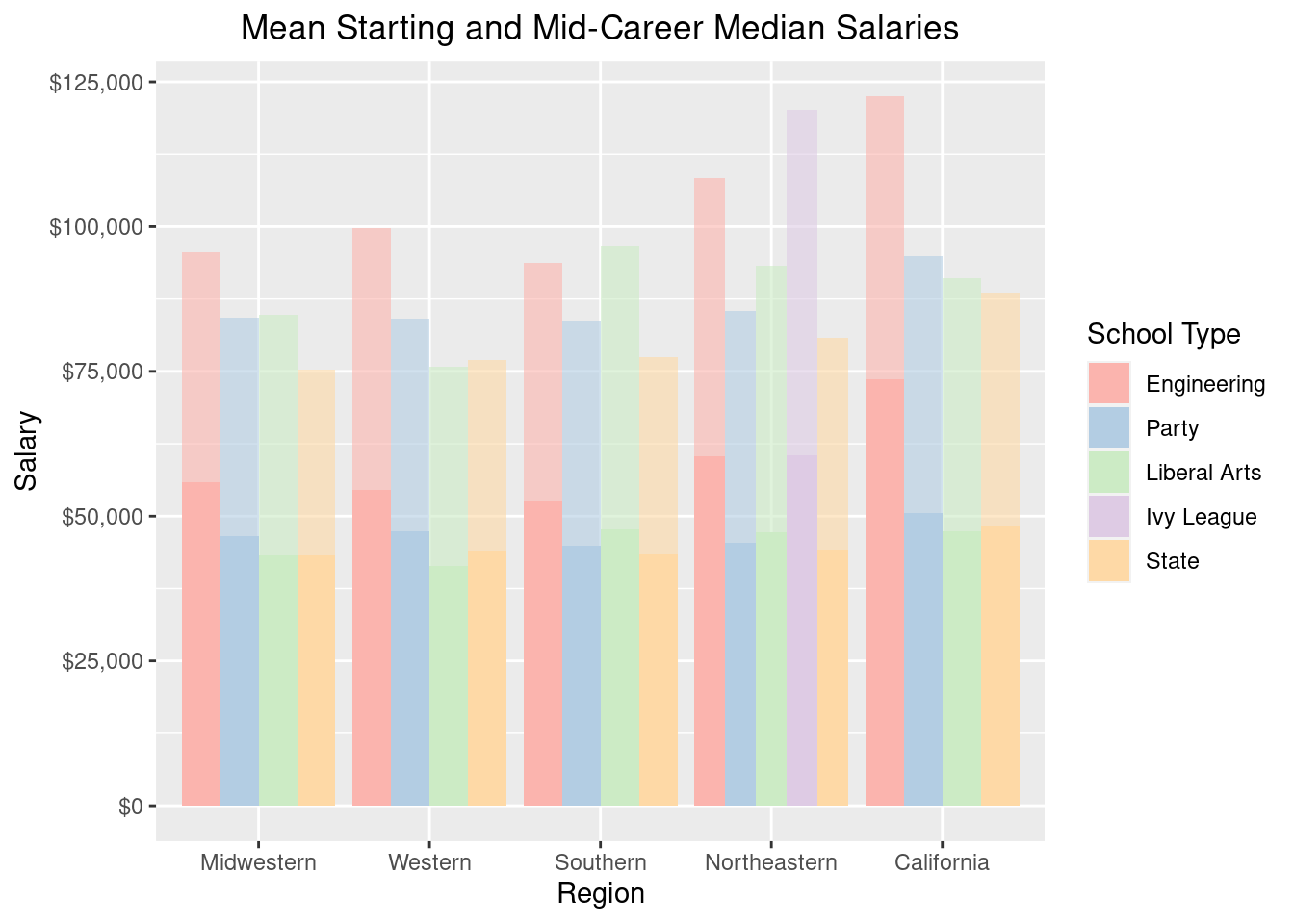
Superimposed on the starting career salaries with a lighter shade is the mid-career salary. The better starting salaries across almost all regions is dominated by Engineering schools. In the Northeast, Engineering and Ivy League starting salaries are pretty even. However at mid-career the value of an Ivy League education is superior. Interestingly, in the South, mid-career salaries tend to be higher for Liberal Arts schools. In California and the rest of the West, if you can’t get into an engineering school, it seems better to attend a Party school than a State school that isn’t a Party school in terms of mid-career salary potential.
Key Takeaways
So what kind of general statements can we make about post-college salaries after our EDA?
By major:
- If you want the highest starting salary, look into Engineering or becoming a Physician’s Assistant
- If highest mid-career salary is what you’re after, consider Engineering
- If you want to see the most percent growth in salary from start to mid-career look into Philosophy and Math
- For careers with the highest earning potential, try Economics or Finance
By college type:
- Most colleges are state schools
- Ivy League and Engineering schools have the best long term mid-career salary potential (followed by Liberal Arts)
- If you are going to a State school, consider one that is also a Party school
By region:
- Try to go to school in California or the Northeast for the highest starting and mid-career salaries
- Considering both college type and region, go to the Northeast for an Ivy League school
- Again considering both type and region, go to California for an Engineering, Party, or State school
- If you want a Liberal Arts school, the South seems to be slightly better
Concluding Remarks
As noted earlier, the EDA component, like the rest of a data scientist’s workflow, is not linear. It involves multiple iterations; my experience has shown me it is a cyclical process.
This demonstration is a simple EDA that can be implemented on most datasets; it certainly is not exhaustive, however, it is useful. Get your hands dirty with the data! Assume that no dataset is clean until you have combed through it. This part of the process is indispensable if your goal is to produce high performing models. As George Fuechsel said, “garbage in, garbage out”.
As always, if you have a question or a suggestion related to the topic covered in this article, please feel free to contact me!