Exploring Diversity in California Schools
library(tidyverse)
library(rvest)
library(knitr)
Keeping with the theme of EDA, in this post I will explore the ethnic diversity of the student population in schools in California. We will utilize the data provided by California Department of Education that has Enrollment by School which includes “school-level enrollment by racial/ethnic designation, gender, and grade.”
We will combine this data with another dataset that contains income information on the schools’ location. Hopefully we will be able to draw some neat inference and plots using these datasets.
Importing the Data
Enrollment Data
We start by downloading the dataset to our local disk and reading it from there. We mainly do this since the download speed of these files are slow. To get an idea of what the data is lets get a glimpse.
data <- readr::read_tsv("filesenr.asp.txt")
head(data) %>% kable()| CDS_CODE | COUNTY | DISTRICT | SCHOOL | ETHNIC | GENDER | KDGN | GR_1 | GR_2 | GR_3 | GR_4 | GR_5 | GR_6 | GR_7 | GR_8 | UNGR_ELM | GR_9 | GR_10 | GR_11 | GR_12 | UNGR_SEC | ENR_TOTAL | ADULT |
|---|---|---|---|---|---|---|---|---|---|---|---|---|---|---|---|---|---|---|---|---|---|---|
| 08100820830059 | Del Norte | Del Norte County Office of Education | Castle Rock | 1 | F | 0 | 1 | 0 | 0 | 0 | 2 | 1 | 1 | 2 | 0 | 1 | 1 | 5 | 6 | 0 | 20 | 0 |
| 08100820830059 | Del Norte | Del Norte County Office of Education | Castle Rock | 1 | M | 1 | 0 | 0 | 0 | 0 | 1 | 1 | 1 | 2 | 0 | 6 | 3 | 4 | 5 | 0 | 24 | 0 |
| 08100820830059 | Del Norte | Del Norte County Office of Education | Castle Rock | 9 | M | 1 | 0 | 2 | 0 | 1 | 0 | 0 | 1 | 0 | 0 | 3 | 3 | 2 | 6 | 0 | 19 | 0 |
| 08100820830059 | Del Norte | Del Norte County Office of Education | Castle Rock | 2 | M | 0 | 0 | 0 | 0 | 0 | 0 | 0 | 0 | 0 | 0 | 0 | 0 | 0 | 1 | 0 | 1 | 0 |
| 08100820830059 | Del Norte | Del Norte County Office of Education | Castle Rock | 7 | M | 0 | 0 | 2 | 4 | 1 | 1 | 3 | 4 | 6 | 0 | 7 | 15 | 10 | 26 | 0 | 79 | 0 |
| 08100820830059 | Del Norte | Del Norte County Office of Education | Castle Rock | 5 | M | 0 | 1 | 0 | 0 | 1 | 0 | 1 | 0 | 0 | 0 | 4 | 4 | 1 | 11 | 0 | 23 | 0 |
One important thing to note is that the CDS_CODE was read as a character, which is better for us since we are using it as an ID. If it was read as in integer, we would lose leading zeros and it could have gotten us in some trouble.
Longitude and Latitude Data
The longitude and latitude of the schools are also available on California Department of Education’s website here. This dataset includes a lot of variables, most of them are uninteresting for this project. We can check it out here:
longlat_raw <- read_tsv("pubschls.txt")
longlat <- longlat_raw %>%
  select(CDSCode, Latitude, Longitude, School, City)
head(longlat) %>% kable()| CDSCode | Latitude | Longitude | School | City |
|---|---|---|---|---|
| 01100170000000 | 37.658212 | -122.09713 | No Data | Hayward |
| 01100170109835 | 37.521436 | -121.99391 | FAME Public Charter | Newark |
| 01100170112607 | 37.804520 | -122.26815 | Envision Academy for Arts & Technology | Oakland |
| 01100170118489 | 37.868991 | -122.27844 | Aspire California College Preparatory Academy | Berkeley |
| 01100170123968 | 37.784648 | -122.23863 | Community School for Creative Education | Oakland |
| 01100170124172 | 37.847375 | -122.28356 | Yu Ming Charter | Oakland |
We see that the the columns have been read in in appropriate ways, thankfully. We recognize the CDS_CODE from before as CDSCode in this dataset which we will use to combine the datasets later.
Income Data
Lastly, we will get some income data. I found some fairly good data on Wikipedia. Here is what it looks like:
url <- 'https://en.wikipedia.org/wiki/List_of_California_locations_by_income'
income_data <- read_html(url) %>%
  html_nodes("table") %>%
  .[2] %>%
  html_table() %>%
  .[[1]] %>%
  set_names(c("county", "population", "population_density",
              "per_capita_income", "median_household_income",
              "median_family_income"))
head(income_data) %>% kable()| county | population | population_density | per_capita_income | median_household_income | median_family_income |
|---|---|---|---|---|---|
| Alameda | 1,559,308 | 2,109.8 | $36,439 | $73,775 | $90,822 |
| Alpine | 1,202 | 1.6 | $24,375 | $61,343 | $71,932 |
| Amador | 37,159 | 62.5 | $27,373 | $52,964 | $68,765 |
| Butte | 221,578 | 135.4 | $24,430 | $43,165 | $56,934 |
| Calaveras | 44,921 | 44.0 | $29,296 | $54,936 | $67,100 |
| Colusa | 21,424 | 18.6 | $22,211 | $50,503 | $56,472 |
Here we see a couple of weird things. All of the columns were read in as characters, which they shouldn’t be since 5 out of the 6 variables are numerical. Lets fix that quickly. Now we have:
income_data$population <- as.character(income_data$population)
income_data$population <- parse_number(income_data$population, locale = locale(grouping_mark = ","))

income_data$population_density <- as.character(income_data$population_density)
income_data$population_density <- parse_number(income_data$population_density, locale = locale(grouping_mark = ","))

income_data$per_capita_income <- as.character(income_data$per_capita_income)
income_data$per_capita_income <- parse_number(income_data$per_capita_income, locale = locale(grouping_mark = ","))

income_data$median_household_income <- as.character(income_data$median_household_income)
income_data$median_household_income <- parse_number(income_data$median_household_income, locale = locale(grouping_mark = ","))

income_data$median_family_income <- as.character(income_data$median_family_income)
income_data$median_family_income <- parse_number(income_data$median_family_income, locale = locale(grouping_mark = ","))

head(income_data) %>% kable()| county | population | population_density | per_capita_income | median_household_income | median_family_income |
|---|---|---|---|---|---|
| Alameda | 1559308 | 2109.8 | 36439 | 73775 | 90822 |
| Alpine | 1202 | 1.6 | 24375 | 61343 | 71932 |
| Amador | 37159 | 62.5 | 27373 | 52964 | 68765 |
| Butte | 221578 | 135.4 | 24430 | 43165 | 56934 |
| Calaveras | 44921 | 44.0 | 29296 | 54936 | 67100 |
| Colusa | 21424 | 18.6 | 22211 | 50503 | 56472 |
We are good to go now.
The Diversity Index
To be able to compare the ethnic diversity between schools we need a measure that describes diversity to begin with. I’ll use a diversity index developed in 1991 by a researcher at the University of North Carolina at Chapel Hill. The index simply asks: “What is the probability that two people in a population picked at random will be from different ethnicity?”
To make sense of this measure, we will look at a plot:
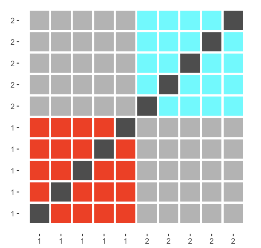
Above, we have a population of 10 people split into two ethnicities, with 5 in each. The colored squares represent random picks with the same ethnicity, light grey squares are picks with different ethnicities, and dark grey indicates impossible picks (the same person being picked twice). Now the diversity index can be calculated by dividing the number of light grey squares with the sum of light grey and colored squares.
First, lets go back to the enrollemnt data. We would like to have it in a different format where each row represents a school. Another thing we want to do is look across each ethnic category within each school. The new dataset that we will be working with is:
small_data <- data %>%
  select(CDS_CODE, ETHNIC, ENR_TOTAL) %>%
  group_by(CDS_CODE, ETHNIC) %>%
  summarize(ENR_TOTAL = sum(ENR_TOTAL)) %>%
  spread(ETHNIC, ENR_TOTAL, fill = 0) %>%
  ungroup()
head(small_data) %>% kable()| CDS_CODE | 0 | 1 | 2 | 3 | 4 | 5 | 6 | 7 | 9 |
|---|---|---|---|---|---|---|---|---|---|
| 01100170112607 | 7 | 3 | 3 | 3 | 1 | 198 | 157 | 19 | 21 |
| 01100170123968 | 3 | 0 | 26 | 1 | 2 | 164 | 51 | 9 | 11 |
| 01100170124172 | 0 | 1 | 227 | 1 | 12 | 34 | 37 | 38 | 137 |
| 01100170125567 | 7 | 1 | 24 | 1 | 4 | 107 | 80 | 116 | 53 |
| 01100170129403 | 1 | 4 | 7 | 1 | 3 | 191 | 32 | 1 | 6 |
| 01100170130401 | 0 | 0 | 0 | 2 | 0 | 24 | 42 | 4 | 1 |
Before we move on, lets reference the data documentation to see what each of the ethnic numbers mean. According to the File Structure:
- Code 0 = Not reported
- Code 1 = American Indian or Alaska Native, Not Hispanic
- Code 2 = Asian, Not Hispanic
- Code 3 = Pacific Islander, Not Hispanic
- Code 4 = Filipino, Not Hispanic
- Code 5 = Hispanic or Latino
- Code 6 = African American, not Hispanic
- Code 7 = White, not Hispanic
- Code 9 = Two or More Races, Not Hispanic
Now we have two decisions to make before moving on. How shoule we take care of the “Not reported” cases, and “Two or More Races, Not Hispanic”? (These are the types of decisions you make during the EDA phase, which then set up your analysis later on)
Lets start with the case of code 0. We notice that the category generally is quite small compared to the other groups, so we need to reason about what would happen if we drop them. If we treat them as a separate group, it would inflate the diversity index so we will drop them.
Dealing with multi-ethnicity is slighlty harder. We have four options:
- Assume everyone in “Two or More Races, Not Hispanic” is the same ethnicity
- Assume everyone in “Two or More Races, Not Hispanic” is all different ethnicities
- Ignore the group “Two or More Races, Not Hispanic”
- Distribute the group “Two or More Races, Not Hispanic” evenly into the other groups
Options 3 and 4 will both yield low diversity indices considering that the choice of “Two or More Races, Not Hispanic” is because these students are different enough not to be put into one of the more precisely defined groups. The first option, while appealling from a computational standpoint, would treat a black-white mixture and an Asian-American Indian as members of the same group even though they have no racial identity in common. Therefore, we will work with the second option which might overestimate the diversity of any given population as it ignores people with “Two or More Races, Not Hispanic” with identical mixes (siblings would be a prime example).
After getting that out of the way, we can thus create a function to calculate the diversity index by using the geometric interpretation from before.
diversity <- function(..., y) {
 x <- sapply(list(...), cbind)
 total <- cbind(x, y)
 1 - (rowSums(x ^ 2) - rowSums(x)) / (rowSums(total) ^ 2 - rowSums(total))
}

data_diversity <- small_data %>%
  mutate(diversity = diversity(`1`, `2`, `3`, `4`, `5`, `6`, `7`, y = `9`))
Now we are ready to bring back the data and start to calculate diversity indices for the schools. Lets run a summary to see the ranges we get and make sure everything is working correctly.
summary(data_diversity$diversity)## Min. 1st Qu. Median Mean 3rd Qu. Max. NA's
## 0.0000 0.3140 0.5205 0.4711 0.6425 1.0000 108All the indices are between 0 and 1 which is good! This means that the diversity index worked as intended. However there are 108 schools that have NA valued diversity. Lets look at those schools:
filter(data_diversity, is.na(diversity)) %>% head() %>% kable()| CDS_CODE | 0 | 1 | 2 | 3 | 4 | 5 | 6 | 7 | 9 | diversity |
|---|---|---|---|---|---|---|---|---|---|---|
| 05615720000001 | 0 | 0 | 0 | 0 | 0 | 0 | 0 | 1 | 0 | NaN |
| 05615800000001 | 0 | 0 | 0 | 0 | 0 | 0 | 0 | 1 | 0 | NaN |
| 06615980000001 | 0 | 0 | 0 | 0 | 0 | 1 | 0 | 0 | 0 | NaN |
| 06616140000001 | 0 | 0 | 0 | 0 | 0 | 0 | 1 | 0 | 0 | NaN |
| 07616630000001 | 0 | 0 | 0 | 0 | 0 | 0 | 0 | 1 | 0 | NaN |
| 07617130000001 | 0 | 0 | 0 | 0 | 0 | 0 | 0 | 1 | 0 | NaN |
It seems that these schools do not have missing values but rather have such a low number of kids that the calculations break down. We will exclude these schools for now.
data_diversity <- data_diversity %>%
  filter(!is.na(diversity))
The first thing we should do with the data is look at the distribution of the diversity indices.
ggplot(data_diversity, aes(x=diversity)) +
  geom_histogram(binwidth = 0.01) +
  xlab("Diversity Index") +
  ylab(NULL) +
  ggtitle("Diversity at California Schools") +
  theme(plot.title = element_text(hjust = 0.5))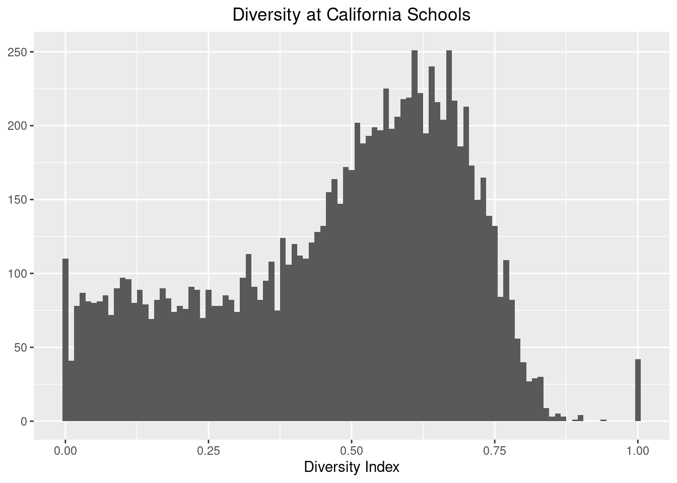
We notice that most of the schools follow a nice shape with a median above 0.5. The only weird thing are the spikes at 0 and 1. Lets look at the 0’s first:
data_diversity %>%
  filter(diversity == 0) %>%
head(20) %>% kable()| CDS_CODE | 0 | 1 | 2 | 3 | 4 | 5 | 6 | 7 | 9 | diversity |
|---|---|---|---|---|---|---|---|---|---|---|
| 02613330137125 | 1 | 0 | 0 | 0 | 0 | 0 | 0 | 3 | 0 | 0 |
| 03100330330035 | 0 | 0 | 0 | 0 | 0 | 0 | 0 | 7 | 0 | 0 |
| 06100660000000 | 0 | 0 | 0 | 0 | 0 | 10 | 0 | 0 | 0 | 0 |
| 09619290000001 | 0 | 0 | 0 | 0 | 0 | 0 | 0 | 4 | 0 | 0 |
| 09619520000001 | 0 | 0 | 0 | 0 | 0 | 0 | 0 | 2 | 0 | 0 |
| 09619866005722 | 0 | 0 | 0 | 0 | 0 | 0 | 0 | 8 | 0 | 0 |
| 09737830000001 | 0 | 0 | 0 | 0 | 0 | 0 | 0 | 4 | 0 | 0 |
| 10621251030873 | 0 | 0 | 0 | 0 | 0 | 6 | 0 | 0 | 0 | 0 |
| 10622650000000 | 0 | 0 | 0 | 0 | 0 | 5 | 0 | 0 | 0 | 0 |
| 10622650000001 | 0 | 0 | 0 | 0 | 0 | 2 | 0 | 0 | 0 | 0 |
| 10623640126870 | 0 | 0 | 0 | 0 | 0 | 70 | 0 | 0 | 0 | 0 |
| 10624300000001 | 0 | 0 | 0 | 0 | 0 | 2 | 0 | 0 | 0 | 0 |
| 10738090123950 | 0 | 0 | 0 | 0 | 0 | 3 | 0 | 0 | 0 | 0 |
| 10738091030147 | 0 | 0 | 0 | 0 | 0 | 11 | 0 | 0 | 0 | 0 |
| 10751271030261 | 0 | 0 | 0 | 0 | 0 | 21 | 0 | 0 | 0 | 0 |
| 10751271030725 | 0 | 0 | 0 | 0 | 0 | 3 | 0 | 0 | 0 | 0 |
| 11101160000001 | 0 | 0 | 0 | 0 | 0 | 2 | 0 | 0 | 0 | 0 |
| 12630401230069 | 0 | 0 | 0 | 0 | 0 | 0 | 0 | 2 | 0 | 0 |
| 13101321330117 | 0 | 0 | 0 | 0 | 0 | 9 | 0 | 0 | 0 | 0 |
| 13630811330141 | 0 | 0 | 0 | 0 | 0 | 14 | 0 | 0 | 0 | 0 |
It seems that all of the schools with a 0 diversity index is because they have students from one ethnicity, which is predominantly category 5 which is “Hispanic or Latino”. Now lets look at the 1’s:
data_diversity %>%
  filter(diversity == 1) %>%
head(20) %>% kable()| CDS_CODE | 0 | 1 | 2 | 3 | 4 | 5 | 6 | 7 | 9 | diversity |
|---|---|---|---|---|---|---|---|---|---|---|
| 01611270130294 | 1 | 0 | 1 | 0 | 0 | 1 | 0 | 0 | 0 | 1 |
| 04614240000001 | 0 | 1 | 0 | 0 | 0 | 1 | 0 | 1 | 0 | 1 |
| 05615806115000 | 0 | 0 | 0 | 0 | 0 | 0 | 1 | 1 | 0 | 1 |
| 09619600000001 | 0 | 0 | 0 | 0 | 0 | 1 | 0 | 1 | 0 | 1 |
| 10621170101949 | 0 | 0 | 0 | 0 | 0 | 1 | 0 | 1 | 0 | 1 |
| 14766870118299 | 0 | 1 | 0 | 0 | 0 | 1 | 0 | 1 | 0 | 1 |
| 14766871430107 | 0 | 1 | 0 | 0 | 0 | 1 | 0 | 0 | 1 | 1 |
| 16638910110858 | 0 | 0 | 0 | 0 | 0 | 1 | 1 | 0 | 0 | 1 |
| 19643370000000 | 0 | 0 | 0 | 0 | 0 | 1 | 0 | 1 | 1 | 1 |
| 19646670000001 | 0 | 0 | 0 | 0 | 0 | 1 | 1 | 0 | 0 | 1 |
| 19646910000000 | 0 | 0 | 0 | 0 | 0 | 1 | 0 | 1 | 0 | 1 |
| 19647090000001 | 1 | 0 | 1 | 0 | 0 | 1 | 1 | 0 | 0 | 1 |
| 19648320000001 | 0 | 0 | 1 | 0 | 0 | 1 | 1 | 0 | 0 | 1 |
| 20764142030070 | 0 | 0 | 0 | 0 | 0 | 1 | 0 | 0 | 2 | 1 |
| 21653340000001 | 0 | 0 | 0 | 0 | 0 | 1 | 0 | 1 | 0 | 1 |
| 22655320000001 | 0 | 0 | 0 | 0 | 0 | 0 | 0 | 1 | 1 | 1 |
| 23102310000001 | 0 | 1 | 0 | 0 | 0 | 1 | 0 | 0 | 0 | 1 |
| 30665630000001 | 0 | 0 | 0 | 0 | 0 | 1 | 0 | 1 | 0 | 1 |
| 32103220108001 | 0 | 0 | 0 | 0 | 0 | 0 | 1 | 1 | 0 | 1 |
| 33671570000001 | 0 | 0 | 0 | 0 | 0 | 1 | 0 | 0 | 1 | 1 |
Intuitively, the only way a school can have a diveristy index of 1 is if the maximum number of students from each ethnicity is 1. Therefore, these schools are rather small.
Lets take a look at the total enrollment in the schools. We have seen a couple of instances with low enrollment and we wouldn’t want those to distort our view.
total_students <- data %>%
  select(CDS_CODE:SCHOOL, ENR_TOTAL) %>%
  group_by(CDS_CODE) %>%
  summarise(ENR_TOTAL = sum(ENR_TOTAL)) %>%
  ungroup()

meta <- data %>%
  select(CDS_CODE:SCHOOL) %>%
  distinct()

ggplot(total_students, aes(ENR_TOTAL)) +
  geom_histogram(bins = 1000) +
  xlab("Total Enrollment") +
  ylab(NULL) +
  ggtitle("Total Enrollment at California Schools") +
  theme(plot.title = element_text(hjust = 0.5))
We see a hump at the 600-700 mark, but a very large spike closer to 0. We should take a closer look at these small values to see what is happening.
total_students %>%
  filter(ENR_TOTAL < 250) %>%
  ggplot(aes(ENR_TOTAL)) +
  geom_histogram(bins = 250) +
  xlab("Total Enrollment") +
  ylab(NULL) +
  ggtitle("Total Enrollment at Smaller California Schools") +
  theme(plot.title = element_text(hjust = 0.5))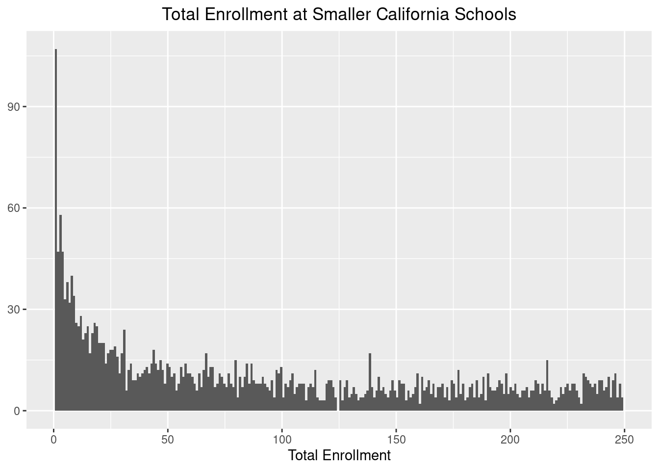
Here, we will make another decision that will change the results of the analysis, but we will restrict the investigation to only include schools with total enrollments of 50 or larger. We do this so that these smaller schools do not skew the distribution of the diversity index.
data_big <- total_students %>%
  left_join(meta, by = "CDS_CODE") %>%
  filter(ENR_TOTAL > 50)
data_enrollment <- data_diversity %>%
  right_join(data_big, by = "CDS_CODE")
One thing we can look at is the relationship between enrollment and diversity. We will fit a simple linear model to start with. I expect larger schools to have more diversity, but lets see:
data_enrollment %>%
  ggplot(aes(ENR_TOTAL, diversity)) +
  geom_point(alpha = 0.1) +
  geom_smooth(method = "lm") +
  theme_minimal() +
  ylim(0,1) +
  labs(x="Enrollment", y="Diversity Index", title = "Relationship between Enrollment and Diversity") +
  theme(plot.title = element_text(hjust = 0.5))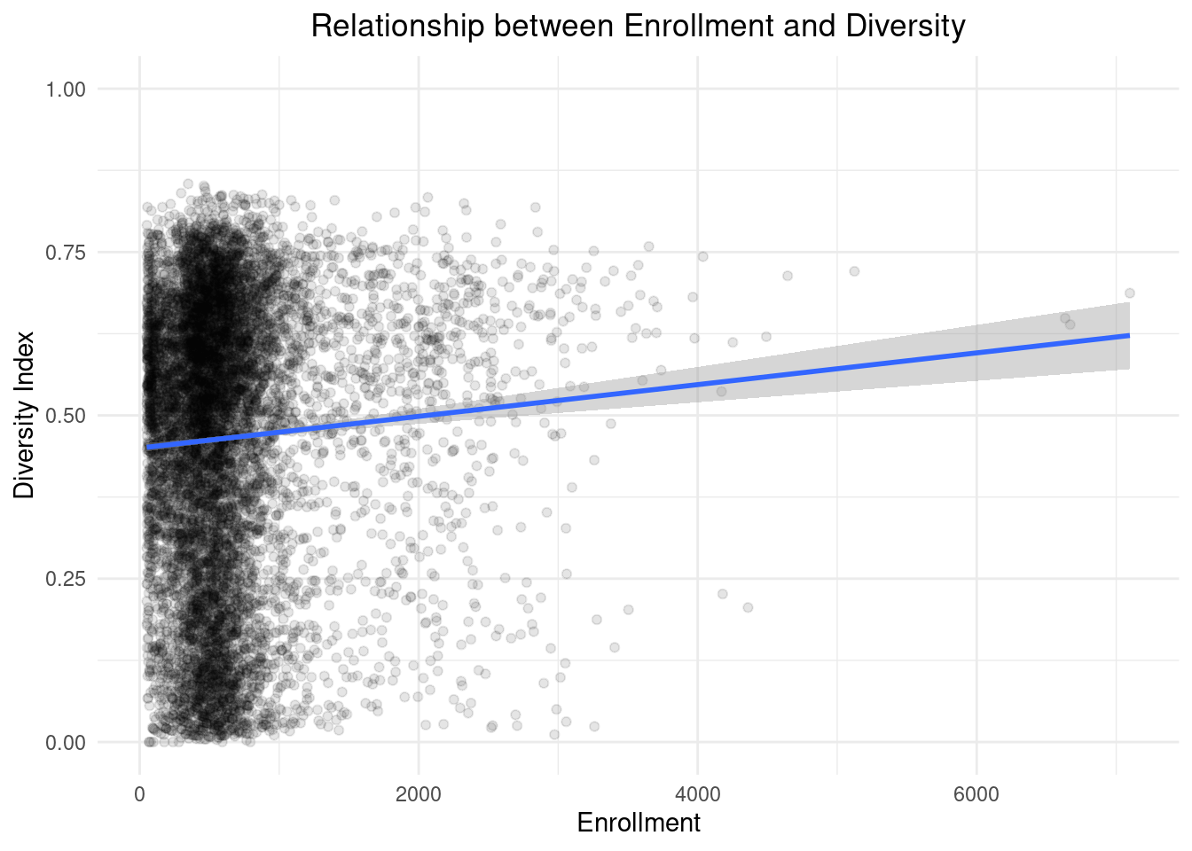
The slope seems quite small but still about a 5% increase in diversity per 2000 students. Lets check the null hypothesis to make sure for statistical significance.
data_enrollment %>%
  mutate(ENR_TOTAL = ENR_TOTAL / 1000) %>%
  lm(diversity ~ ENR_TOTAL, data = .) %>%
  summary()
##
## Call:
## lm(formula = diversity ~ ENR_TOTAL, data = .)
##
## Residuals:
## Min 1Q Median 3Q Max
## -0.51078 -0.15751 0.05026 0.17040 0.39595
##
## Coefficients:
## Estimate Std. Error t value Pr(>|t|)
## (Intercept) 0.449955 0.003429 131.223 < 2e-16 ***
## ENR_TOTAL 0.024282 0.004063 5.976 2.37e-09 ***
## ---
## Signif. codes: 0 '***' 0.001 '**' 0.01 '*' 0.05 '.' 0.1 ' ' 1
##
## Residual standard error: 0.2136 on 9472 degrees of freedom
## Multiple R-squared: 0.003756, Adjusted R-squared: 0.003651
## F-statistic: 35.71 on 1 and 9472 DF, p-value: 2.371e-09The results show that we can reject the null hypothesis of no correlation and we get a better estimate of the slope of 2.3%. Its important to keep in mind that we have a miniscule R-squared, so we dont think there is much of a relationship here.
Does this have anything to do with money?
I will end this post by bringing in the income data and checking if there is a correlation between median household income in the county in which the school is located and the schools’ diversity indices.
data_enrollment %>%
  left_join(income_data, by = c("COUNTY" = "county")) %>%
  ggplot(aes(x=median_household_income, diversity)) +
  geom_jitter(alpha = 0.1, width = 500) +
  geom_smooth(method = "lm") +
  ylim(0,1) +
  labs(x="Median Household Income", y = "Diversity Index", title = "Correlation between Diversity Index and Median Household Income \n(in CA counties)") +
  theme(plot.title = element_text(hjust = 0.5))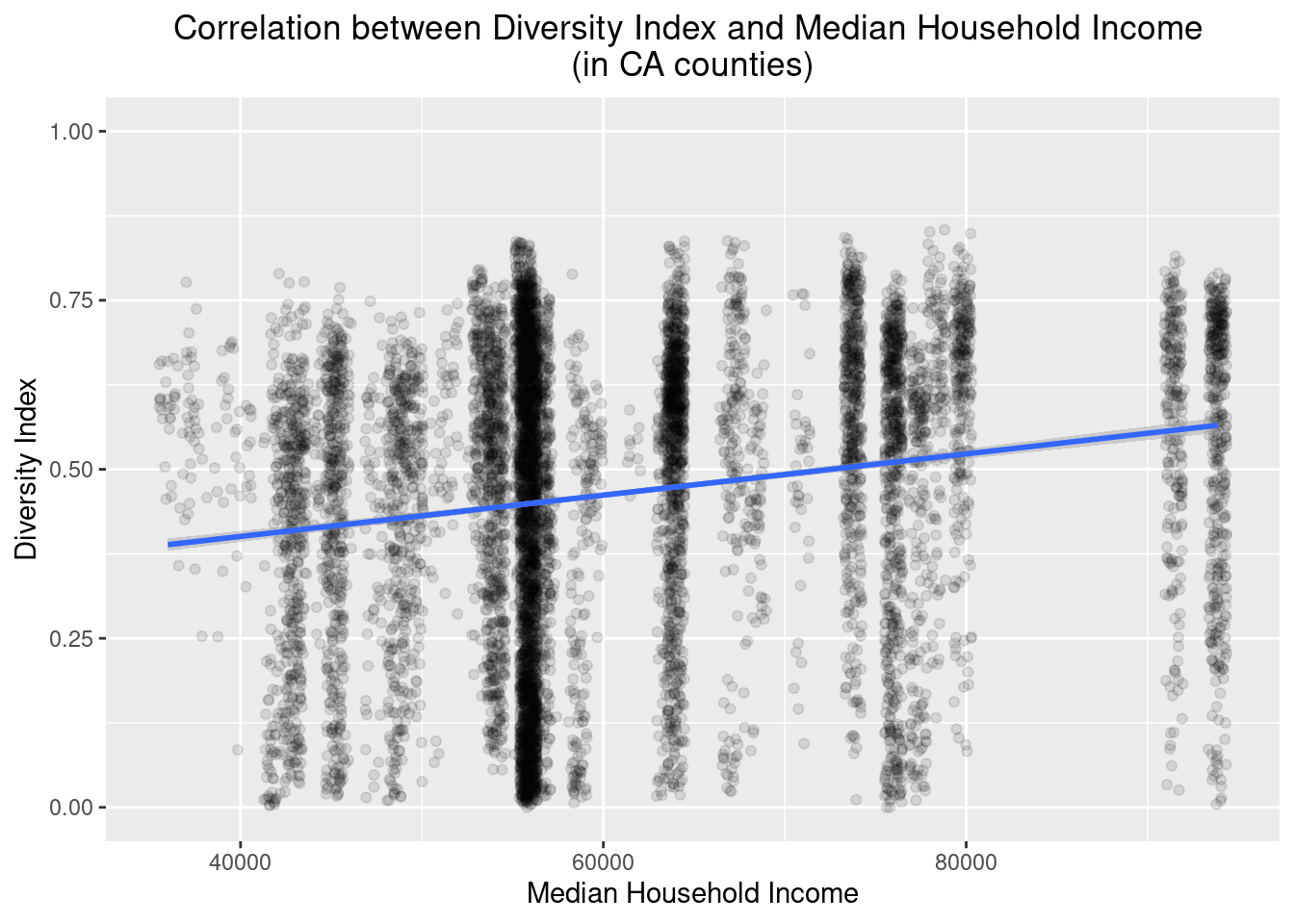
As always, if you have a question or a suggestion related to the topic covered in this article, please feel free to contact me!