The Dangers of Visualizations
Mark Twain once said “There are three kinds of lies: lies, damned lies and statistics.” The phrase describes the persuasive power of data, and particularly the use of statistics to support weak arguments. Up to now, I have covered different ways to display and make conclusions based on data. So are we just telling lies? All I am saying is that when you work with data, you have to be careful.
How do we analyze this data? How do we look at it to get an accurate picture of what’s going on? It’s incredibly easy when you start adding in different dimensions, to completely get the wrong insight from data. It’s way too easy to abuse data, consciously and unconsciously. With the growing trend of visualizing data to make a point that can be far less dramatic with a table filled with numbers, this can become even more dangerous.
A famous example of a misleading visualization is a map of The London Underground: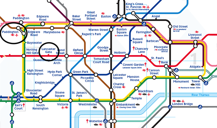
It represents specific data points, Underground stations, as they exist in and around London. But it’s misleading, because it’s stylized. Let’s say you are staying at the Rhodes Hotel, which is near the Lancaster Gate station, and you needed to get to Paddington Station to catch a train. Based on this map, what would you do? Most people, including me, would say they would walk to Lancaster Gate, hop on the Red line to Notting Hill Gate, and then change to a Yellow or Green Line train up to Paddington. Easy right? Great map.
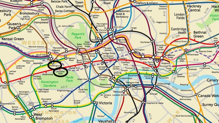
How about now? This is a true map of London so that the stations are shown where they exist in reality. Still want to use the same route, or maybe you want to think about whether it’s a walkable distance?
Here’s a Google Map of the area:
If you were staying at the Rhodes Hotel, sure the Lancaster Gate station is right around the corner, but Paddington Station is waiting for you two blocks in the other direction. Still want to catch the subway (shown in the map by the black line), or do you want to walk? Is the traditional map inaccurate? Yup. It’s stylized to be more attractive, compact, clean, and helpful, but that causes inaccuracies, and leads people to make the wrong decision.
Ok, but this looks nothing like the bar graphs, maps, and line charts we are used to. Let’s take a look at data. Here is an example of a company’s conversion rates:
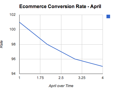
eCommerce rates are dropping. Terrible right? Someone is probably going to get fired. But wait, this plot is not showing the full story. The bound for the y-axis starts at 94 and goes up to 101 (1.01% and 0.94% conversion rates). But still it’s a drop! We should be concerned. Look how much it drops:
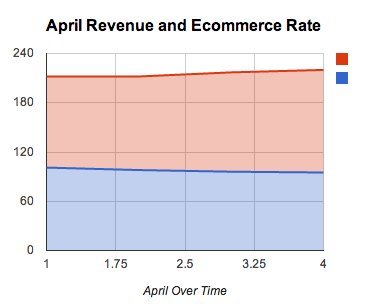
Not that much really. You’re looking at one metric, and one that can be affected by lots of other factors. A big referral link to your site drives a bunch of traffic to a blog post, but none of them turn around and convert, and your conversion rates drop for the site as a whole. But maybe your good traffic also increased, your organic search traffic increased, and your revenue from those people increased. Suddenly you’re looking at revenue picking up, with a slight dip in the conversion rate.
I am by no means advocating against data visualizations. A great data visualization can tell a story in a way that might even convince Mark Twain that you’re right. No matter how pretty your visualization, make sure that you’re looking at the whole story of the data, and that you have good data, or your fancy visualization might just be more lies, damned lies, and statistics.
It is important to note, the examples above are not about lying with statistics since no statistical methodology is being used. Rather, the ethics of journalism are being violated by these visualizations with a misunderstanding of statistics.
Practical Tips
Here are six tips for creating better visualizations:
- Get as much data as you can, and make sure it’s reliable
- Choose the right design for your chart. Should it be a line graph, heat map, pie chart or something else? This blog post from HubSpot has information on chart types and how to select one to best visualize your data
- Be intentional about the variables you include
- Use consistent scales when comparing data
- Think carefully about what you name your chart. A well-made chart can become misleading if your title or headline makes claims that the data doesn’t support
- Publish the source data and methodology used to create the visualization
As always, if you have a question or a suggestion related to the topic covered in this article, please feel free to contact me!